4 Key Components of Your Website’s Homepage
January 15, 2019 in Techno Bytes3 minutes

Explore the essential elements that make a homepage not just good, but great. From our extensive experience, we reveal the 4 key components that are the backbone of successful websites.
Your website’s homepage is the heart of your business. That’s where visitors get to know you. That said, how does your homepage look? Being in the ecommerce industry for over a decade and having analyzed thousands of successful websites, I see a pattern. This pattern includes four key components.
As a disclaimer, I am not selling any service. I am sharing my thoughts and knowledge through my blog, so mine does not follow any of the rules below.
4 Key Components of Your Website’s Homepage
Start with the WHY
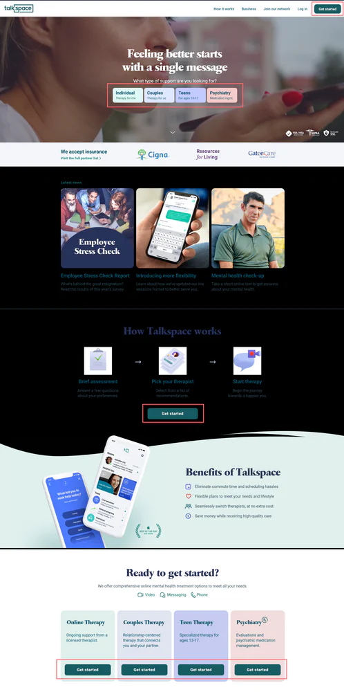
Why do you exist? Why you? – Let’s talk about TalkSpace, a company that offers online therapy to their patients. Their message is strong and clear: “Feeling better starts with a single message.” They are speaking directly to their customers who are looking to feel better.

Compare it with your message.
Is your message clear to your customers/clients? Does your brand message directly target your customer base? Let’s say you are running a workout studio and your customers are working moms.
Your message should look like “Short, meaningful workouts for wonderful moms like you! Join us!”
This translates into your brand message:
We provide busy moms with short, meaningful workouts they can use to stay healthy and energized.
Authenticity: Prove to customers you are real
Customers are nervous about being scammed. They are looking for authenticity. My idea is simple: if they trust Brand A and Brand A is using your service, that signals trust to them. Add any certifications, associations, and partnerships. Here is an example: Look at how FreshWorks proves their identity. Most of you reading this article might have come across two or more brands listed.
Herd Mentality – Tell your customers they are not alone
Early adopters will find you no matter what. But they are only a fraction. The rest are fast followers and late adopters. They need to be convinced. Show them testimonials, reviews, and your portfolio/work you have done for customers. Make sure that the reviews and testimonials have real names, real photos, and legitimate content. Adding numbers makes it even more legitimate, just like the example below.
Call to action – Psychology of 6
It takes six or more times for someone to act on a message. Large brands and enterprises know this. Your call to action, whatever it may be, should be repeated frequently and appropriately on your homepage. Make sure you give several ways to reach out to you. Also, include a form to collect the email/phone number.
See this example: TalkSpace has placed the Call To Action button at least nine times on their homepage.

Conclusion
This approach works; it’s timeless. While branding is a lot more than designing your homepage, these four components guide you to put the design into action. Your brand is a story, and your homepage is a preview that lets customers decide whether to read your story or not. Make your impression.